LP design by Furorida Sandee
View PC page
View SP page

LP design by Furorida SandeeLP information
- Registration date 2026-09-16
- https://www.akagi.com/brand/florida-sundae/2026new/autumn-design
- Product/service name
- Furorida Sandee
- Categories
- ice
- Company name
- Akagi Nyugyo Kabushiki Kaisha(Saitama-ken Fukaya-shi)
- Color
- We design LPs using Purples
- Image
- These LPs have a "Simple" style design
- Catchcopy
- Enjoy the signature sauce to the last bite! Furorida Sandee
- Design
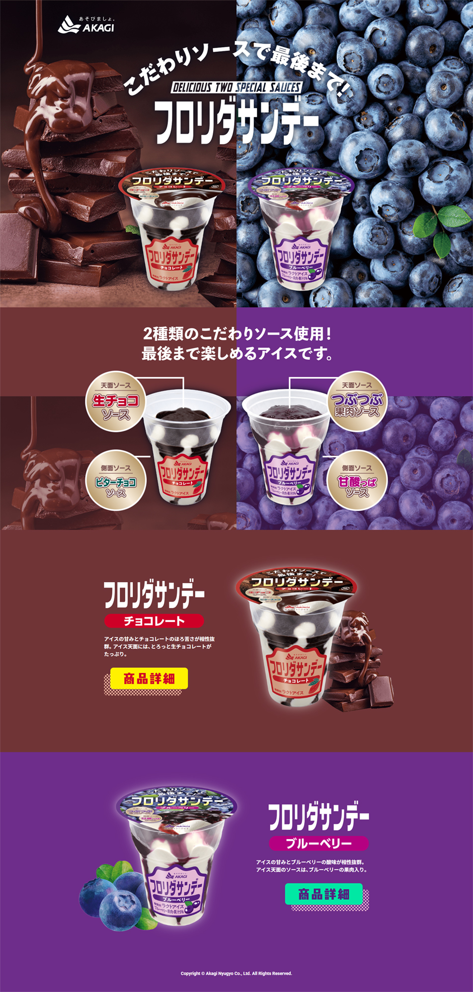
- Bold visuals that emphasize a sense of sizzle: at the very top of the screen we prominently place large real-life photos of melting chocolate and fresh, juicy blueberries. Rather than showing the ice cream by itself, we deliberately foreground appetizing visuals of the ingredients themselves (sizzle), creating an immediate impression of richness and deliciousness. Clear color zoning by flavor splits the screen in two using the product's image colors: chocolate as 'deep brown' and blueberry as 'vivid purple'. This instantly communicates that there are two flavors and prevents the viewer's eye from wandering. In the central diagram explaining the product's 'carefully crafted structure', the product packaging is shown semi-transparently (or like a cross-section), and the positions of the two types of sauce on the top and the side are explained with illustrations and text. This layout makes the product's greatest strength — that you can enjoy the sauce to the very last bite — understandable at a glance without reading the text. Retro-pop logo and font usage: because the product was revived from a 1980s hit, the product logo uses a thick, nostalgically shaped font (retro-pop). The background gradient and rounded speech-bubble designs also give a poppy, friendly impression. Overall, rather than being a smart, stylish design, it is a powerful design that straightforwardly conveys the messages 'looks incredibly delicious' and 'feels luxurious'.
【Note】 The landing page shown above was not designed by our company.
※You can view our production portfoliohere.
Clicking the design opens the source website.
*The original site may have been modified or removed.