LP design by TOKYONONSENSE9
View PC page
LP design by TOKYONONSENSE9LP information
- Registration date 2026-09-16
- https://www.dot-st.com/hare/cp/tn9
- Product/service name
- TOKYONONSENSE9
- Categories
- Events, Campaigns, Gifts
- Company name
- HARE(Tokyo-to Shibuya-ku)
- Color
- We design LPs using yellow
- Image
- These LPs have a "Simple" style design
- Catchcopy
- TOKYONYANNSENSE
- Design
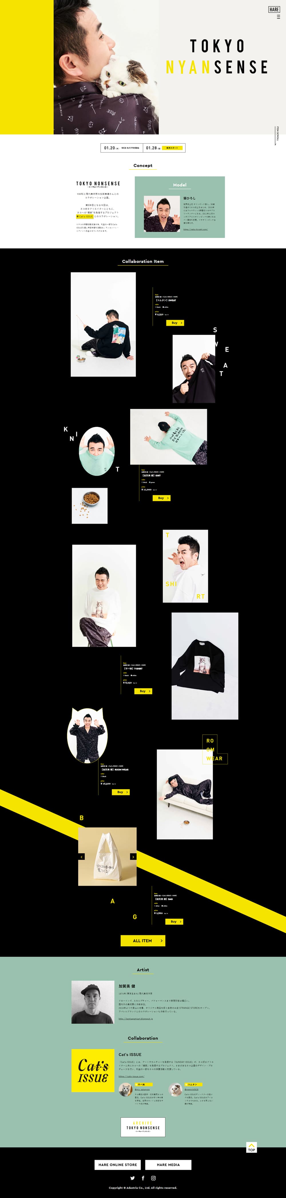
- Overall, this is a distinctive and memorable fashion landing page design that blends HARE's characteristic sense of mode with a playful spirit. Centered on black and white, it effectively expresses an urban, edgy worldview by boldly incorporating the brand color, vivid yellow, as an accent. In the first view, photos and typography are arranged simply, and by making use of whitespace, a high level of design and the brand's presence are conveyed.
Throughout the page, product photos are deliberately not arranged in a regular order; by placing large and small visuals and text elements randomly, it creates a sense of rhythm akin to the pages of a fashion magazine. The alternation between wide whitespace and bold black backgrounds makes each item's appeal stand out, creating a structure that offers new discoveries as you scroll. The typography mainly uses slender Latin type, and the balance with whitespace emphasizes a refined impression.
The balance of placement among photos, text, and graphics is excellent, resulting in a highly branded web design that conveys not just product introductions but also the brand's culture and the world of its collaborations.
【Note】 The landing page shown above was not designed by our company.
※You can view our production portfoliohere.
Clicking the design opens the source website.
*The original site may have been modified or removed.