LP design by 2-night, 3-day Kusatsu trip
View PC page

LP design by 2-night, 3-day Kusatsu tripLP information
- Registration date 2026-09-16
- https://hoshinoresorts.com/jp/sp/kusatsu-stay/
- Product/service name
- 2-night, 3-day Kusatsu trip
- Categories
- Domestic and international travel
- Company name
- Hoshino Rizōto(Gunma-ken Agatsuma-gun)
- Color
- We design LPs using Shades of grey
- Image
- These LPs have a "Simple" style design
- Catchcopy
- Kusatsu just for me, to my heart's content
- Design
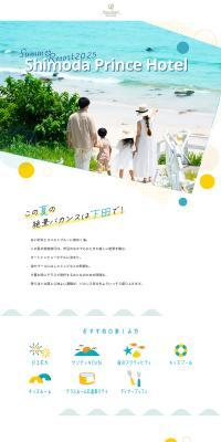
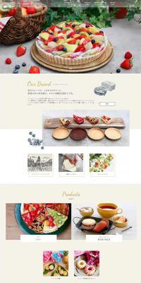
- Overall, this is a web design with an exceptionally complete sense of world, expressing the charm of nature and travel through delicate illustrations and generous use of white space. Using a pale beige base combined with soft hues such as blue, green, and pink creates a calm and refined atmosphere. While it is a tourism site, it does not push information excessively to the forefront, instead offering an emotional design that stirs anticipation and imagination before visiting.
The tall, vertically extended layout that lavishly uses white space creates a relaxed rhythm throughout the page, providing an experience akin to reading a single story as you scroll. Hand-drawn-style illustrations and delicate decorative motifs are effectively placed, visually conveying the region's charm and warmth.
Typography is unified with a delicate and elegant impression, designed so that even sections with large amounts of text do not feel oppressive. The combination with photographic content is also beautiful; the harmony between natural landscapes and illustrative expression further strengthens the impression of the brand's world.
Overall, this is a highly accomplished tourism promotion site that not only conveys information but also evokes the emotion "I want to visit this place," combining narrative quality and design.
【Note】 The landing page shown above was not designed by our company.
※You can view our production portfoliohere.
Clicking the design opens the source website.
*The original site may have been modified or removed.