LP design by Jaianto Kōn × Kusuriya no Hitorigoto Collaboration Campaign
View PC page
View SP page



LP design by Jaianto Kōn × Kusuriya no Hitorigoto Collaboration CampaignLP information
- Registration date 2026-09-17
- https://cp.glico.com/giant-2026aut/
- Product/service name
- Jaianto Kōn × Kusuriya no Hitorigoto Collaboration Campaign
- Categories
- Western confectionery
- Company name
- Ezaki Glico Kabushiki Kaisha(Osaka-fu Osaka-shi Nishiyodogawa-ku Utajima 4-chome 6-ban 5-go)
- Color
- We design LPs using Brown tones
- Image
- These LPs have a "Arts" style design
- Catchcopy
- Osaka-fu Osaka-shi Nishiyodogawa-ku Utajima 4-chome 6-ban 5-go
- Site Description
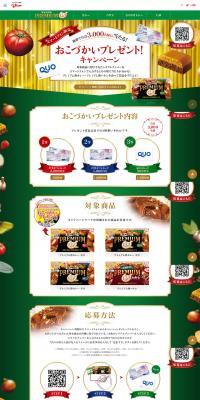
- This is the official site page for the 'Jaianto Kōn × Kusuriya no Hitorigoto Collaboration Campaign'.
- Design
- This landing page features a striking design that effectively fuses a Japanese aesthetic world with the appeal of character content. Using a traditional color scheme centered on red, green, and navy, it strongly conveys a Japanese-style atmosphere and sense of narrative, allowing visitors to enjoy the brand's unique world throughout the page. The top visual prominently places characters and product imagery to realize a highly persuasive first view that captures visitors' interest. In addition, each content section is composed with a tidy layout that makes use of whitespace, preserving readability even when information density is high. Product introductions, rankings, and explanations of how to play are also arranged to be visually clear, providing excellent user flow that enables users to naturally understand the content. The unified illustrations, decorative materials, and color usage produce a high-quality LP design that balances immersion in the world with usability.
【Note】 The landing page shown above was not designed by our company.
※You can view our production portfoliohere.
Clicking the design opens the source website.
*The original site may have been modified or removed.