LP design by premal
View PC page

LP design by premalLP information
- Registration date 2026-09-25
- https://sfc.jp/ie/lineup/premal/
- Product/service name
- premal
- Categories
- architecture
- Company name
- Sumitomo Ringyo Kabushiki Kaisha(Tokyo-to Chiyoda-ku)
- Color
- We design LPs using Green tones
- Image
- These LPs have a "Simple" style design
- Catchcopy
- A step above simplicity. premal (Puremaaru)
- Design
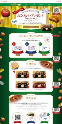
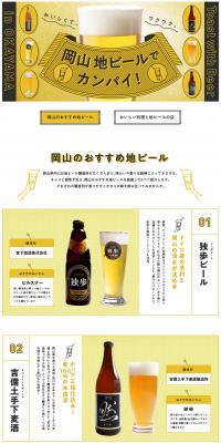
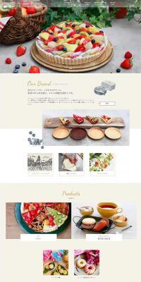
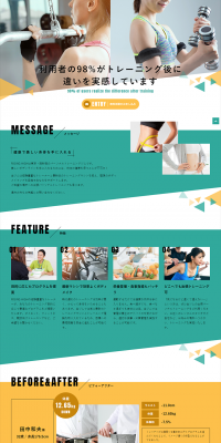
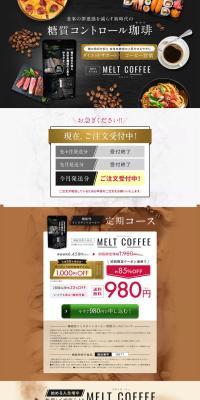
- This landing page features a compelling, high-impact design that presents abundant product information through dynamic visuals and continuously draws users' interest. By centering on strong colors such as red, black, gold, and orange, it effectively emphasizes the product's impact and appetite appeal. In particular, large photos of dishes and products are placed prominently, and by combining catchphrases, numbers, and emphasized text, each section's key points are conveyed at a glance. A variety of content — including people photos, reviews, rankings, and comparison information — are arranged with good tempo, giving users the enjoyment of encountering new information as they scroll the page. It's also notable that while introducing variation in background colors, decorations, and headline design, the overall unity is maintained. By leveraging the large amount of information to convey product appeal and usage imagery from multiple angles, the layout naturally raises user interest. It is a highly polished landing page (LP) design that balances visual impact with informational persuasiveness, conveying a sense of energy and momentum.
【Note】 The landing page shown above was not designed by our company.
※You can view our production portfoliohere.
Clicking the design opens the source website.
*The original site may have been modified or removed.